Super Deluxe Message Board
March 21, 2007, 07:53:47 PM *
Welcome, Guest. Please login or register.

Login with username, password and session length
News: New stage and other stage updates!
 
   Home   Help Search Login Register  
Pages: [1]
  Reply  |  Print  
Author Topic: SDM STAGE WARS Tactics  (Read 218 times)
DGJ
Administrator


View Profile WWW
« on: February 18, 2007, 08:48:35 PM »
Reply with quoteQuote

For those of you wondering what kind of things you should be looking at while making a stage for STAGE WARS, here are some examples of what you should strive for/try to avoid when making a stage for the contest.

The main thing I want to point out are "boring stages".  A boring stage would look something like this:


It's just monotonous, repeated patterns.  There is very little to look at, and it's just plain dull.  This is not what I think of when I think Kirby Super Star!
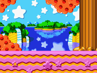


That's a little bit better.  This isn't from any particular part of the stage (the first stage of Dynablade, BTW), but rather a collection of elements from the entire stage.  This is definitely more interesting to look at than the original image.  Probably the best advice I can give in regards to this kind of thing is to pay attention to the stages in a game like Super Smash Bros Melee.  The stages in that game are very exciting to look at and are very representative of their original game.  That's the kind of thing you should aim for.



Ah, the resized stage.  Just because the source game has small characters doesn't mean you need to resize the entire background for use in a fighting game.  It doesn't look good with normal characters and it doesn't look good with small characters.  So why do it??
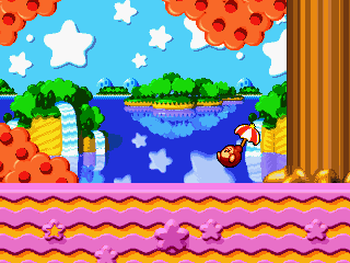


Here's one of my biggest pet-peeves.  We've all seen those stages with standing sprites of like Rock Howard or Chun-Li in them called "MUGEN Party" or something equally retarded.  Ignoring the fact that they inherently look stupid because of mismatched sprite styles, they make it difficult to figure what is part of the background and what is in play.  If you're going to include stuff like that in a stage, at least mess with a contrast a little so it doesn't stick out so much.

That's all I got off the top of my head.  If I can think of anything more or if any of the other judges have anything they want to mention, this thread will be updated with that info.  If you have any questions about anything you're unsure of then feel free to post it in this thread or send me an e-mail.  I hope this helps!
Logged

CRAZY GONNA CRAZY
Jango
Moderator


i like the shape of your head


View Profile
« Reply #1 on: February 19, 2007, 08:15:07 PM »
Reply with quoteQuote

Since I know some of the entrants are likely to make their own music for the stages, I guess it might be good to give general guidelines about that.

1) Don't incorporate music from other sources if the materials are conflicting. For example, Legend of Zelda music should NEVER be paired up with Linkin Park music under any circumstances.

2) While I'm talking about Linkin Park, avoid incorporating lyrics into your stage. Unless it's part of the BGM of the original stage, or if the lyrics are considered more of a background sound (a good example of this would be Daft Punk's "Super Heroes," which loops a segment of a Barry Manilow song and treats the vocals as a baseline), it probably shouldn't be in your stage.

3) Unless your stage originally had a slow BGM, don't make your new song slow.

4) When remixing your music, think about the best way to incorporate new elements while keeping the "main idea" of that song in mind. For an excellent example of this, take note of the Brambles music in Donkey Kong Country 2, and compare it to the remix Protricity made.

Download Original
Download Protricity's remix from OCRemix

I think that takes care of music remixes, I guess.
Logged

DGJ
Administrator


View Profile WWW
« Reply #2 on: March 04, 2007, 12:25:30 AM »
Reply with quoteQuote

I said that readmes are required with each entry, but I realized I didn't say anything about what should be in the readme.  Here's an example of a good readme:

Quote
--/Yossy's Stolen Stage\--
Source: Kart Fighter, but originally from some other NES game called "Little Nemo".
Ripped by Jango
Created 7/13/06

NOTES:
------
I was ripping music from the Kart Fighter ROM for the hell of it, when I realized that on KFM's Kart Fighter stage rampage, he forgot stages for Yossy (Yoshi) and the Mario Bros. Seeing that Yoshi's stage not only came from another game, but was hilariously irrelevant to the Mario universe, I decided to make it.

DEVIATIONS:
---------
- Not accurately colored. I know you're thinking "How in the hell do you screw up an NES stage?" Well, there were a bunch of miscolored parts that looked really wrong, so I colored them based on similar objects in the background.
- Clouds move. Yeah, KFM's suggestion. Looks nice, although it was a pain in the ass to get right.

CREDITS:
--------
Those wacky Hong Kongers
 - For making Kart Fighter and stealing a stage from Little Nemo.

Whoever made Little Nemo
 - Made the stage in the first place.

VirtuaNES
 - Still my favorite NES Emulator

So at the bare minimum, include your own name and the stage's name/source.  If you wanna go the extra mile, though, add some information about why you chose the stage, explain what you were trying to do with certain things, etc. etc.  At the very least, it might help explain something to the judges they didn't understand/realize about the stage before.
« Last Edit: March 04, 2007, 12:29:48 AM by DGJ » Logged

CRAZY GONNA CRAZY
Pages: [1]
  Reply  |  Print  
 
Jump to:  

Powered by MySQL Powered by PHP Powered by SMF 1.1.2 | SMF © 2006-2007, Simple Machines LLC Valid XHTML 1.0! Valid CSS!